When Less is More: Trimming Form.io Options To Help the Newbie
- How-To,
- News
Sometimes you just want to look straight ahead and see everything you need to see. That’s what prompted an AOT team to cut options in order to improve the user experience of Form.io novices.
You might think that the more options you can offer a user, the better, but in fact too much choice can be overwhelming. Furthermore, most users might not even understand some of the options, let alone use them, so much of the screen just turns into a discouraging visual clutter.
This is the challenge we faced when dealing with a screen on Form.io that allows users to edit components. In essence, we had to figure out how to edit an edit page, but we had trouble figuring out how from the documentation. If you face the same challenge of looking for such answers, I hope that by the end of this article I’ll have saved you so much research time that you’ll owe me a cup of tea.
What’s Form.io?
Form.io is an application that offers a dynamic form-building solution with features such as data management through API and user management, among other features. It’s particularly nice that Form.io can be embedded in a front-end application. React, for instance, puts Form.io’s features into a library called React Formio.
So?
With forms at the core of our project, we had to ensure a high level of form-building functionality. After our own research and advice from our peer teams, we chose Form.io as our solution. Form.io plays a crucial role in our forms, workflow, and analytics platform formsflow.ai. Due to the client’s particular needs we felt it would be best to stick to Form.io as a standalone solution, but we did consider formsflow.ai’s wider range of features including intelligent forms design, workflow mapping, data analytics, and user management.
So, let’s take a first look at Form.io’s form builder:
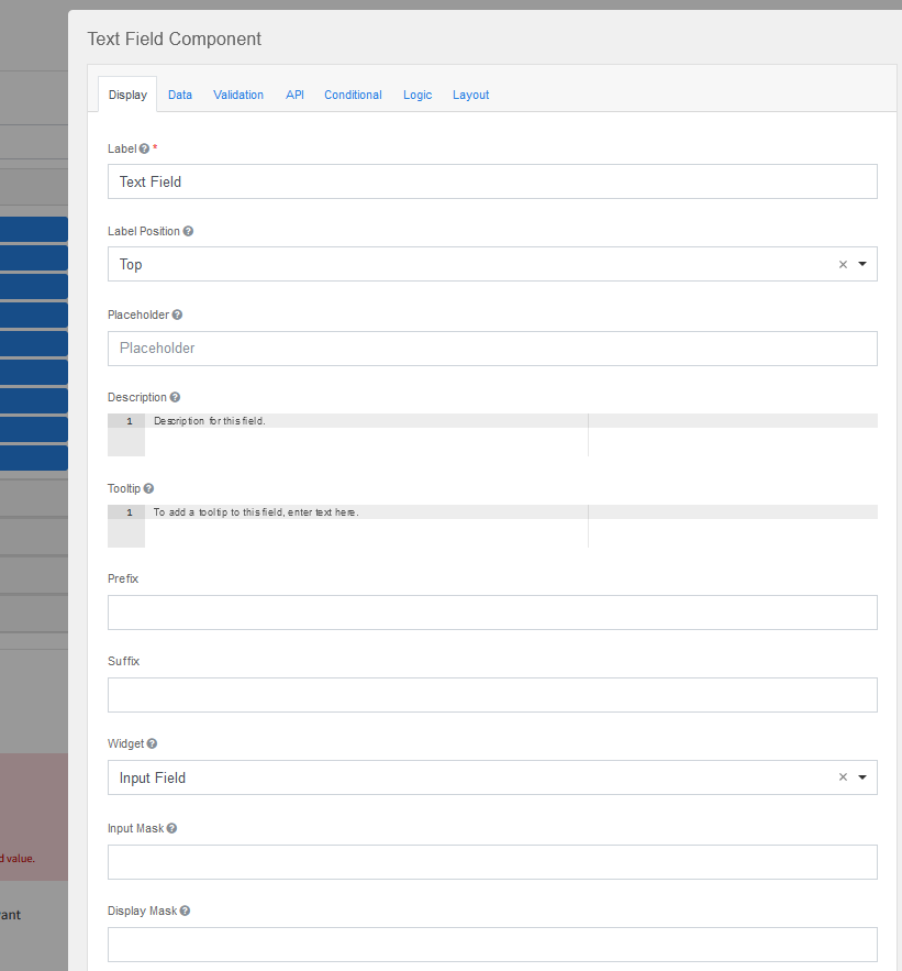
Here you can see draggable components grouped into basic, advanced, layout, data, and premium categories. When you drop the component icon into the form-design area, an edit-form modal opens:
The edit form offers many options through the Display, Data, Validation, API, Logic, and Layout tabs, but we found that two or three tabs would be better for a new user who might otherwise feel overwhelmed. In addition, we wanted to prune the options on the tabs we did keep as users were unlikely to need to specify custom CSS, tab index, widget, prefix, or suffix.
Our research for the Form.io documentation found good guides on removing and adding custom components and component sections. However, we didn’t see much discussion about eliminating specific tabs and options from the edit form modal. We did find some documentation on modifying the edit modal, but it wasn’t clear enough on how to remove specific tabs and keep specific options within particular tabs.
We spent significant development time reviewing our colleagues’ experience as well as Stack Overflow questions and answers. We also dove into the Form.io code module so we could learn more about how the component was configured. We were then able to customize the edit form in order to simplify the user experience.
Customizing Form.io’s Edit-form Modal
To customize the edit form, we found four ways that worked.
Method #1: Edit the Options Fields
We could customize edit options by passing a JSON object to a React FormBuilder component. Through this method we could add or remove component tabs, and remove or customize component options under the tabs that remained. We were also able to customize the edit form that pops up when a user drags and drops a component into the form-design area. Here’s how we started:
<FormBuilder form={{ display: 'form' }} options={formioOptions} />
The code below shows first how we hid the advanced, data, and premium component sections. We then modified the options the user can see in the text field component’s edit-form modal.
export const formioOptions = {
    builder: {
        advanced: false,
        data: false,
        premium: false,
    },
    editForm: {
        textfield: [
            {
                key: 'display',
                components: componentsToHide,
            },
            {
                key: 'data',
                ignore: true,
            },
            {
                key: 'api',
                ignore: true,
            },
            {
                key: 'conditional',
                ignore: true,
            },
            {
                key: 'logic',
                ignore: true,
            },
        ],
        //We can do same as above for the textarea component
        textarea: [],
    },

};
The corresponding tabs in the edit-form modal are hidden by passing objects with the key name of the specified tab and the ignore field set to true.
Similarly, we can reduce the options within tabs by passing a components field with the ‘ignore’ set to true for the redacted components.
const componentsToHide = [
    {
        key: 'labelPosition',
        ignore: true,
    },
    {
        key: 'widget.type',
        ignore: true,
    },
    {
        key: 'inputMask',
        ignore: true,
    },
    {
        key: 'displayMask',
        ignore: true,
    },
    {
        key: 'allowMultipleMasks',
        ignore: true,
    },
    {
        key: 'customClass',
        ignore: true,
    },
    {
        key: 'prefix',
        ignore: true,
    },
    {
        key: 'suffix',
        ignore: true,
    },
    {
        key: 'hidden',
        ignore: true,
    },
    {
        key: 'hideLabel',
        ignore: true,
    },
    {
        key: 'showWordCount',
        ignore: true,
    },
    {
        key: 'showCharCount',
        ignore: true,
    },
    {
        key: 'autofocus',
        ignore: true,
    },
    {
        key: 'spellcheck',
        ignore: true,
    },
    {
        key: 'disabled',
        ignore: true,
    },
    {
        key: 'tableView',
        ignore: true,
    },
    {
        key: 'modalEdit',
        ignore: true,
    },
    {
        key: 'hideInput',
        ignore: true,
    },
    {
        key: 'mask',
        ignore: true,
    },
    {
        key: 'tabindex',
        ignore: true,
    },
    {
        key: 'autocomplete',
        ignore: true,
    },
];
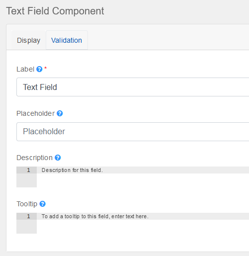
The result of the above options:
Method #2: Replace the Options Tab with a Brand-new Customized Version
We can also add our new custom display tab by replacing the original options tab file and creating our own from scratch:
editForm: {
    textfield: [
        {
            key: 'display',
            ignore: true,
        },
        {
            key: 'data',
            ignore: true,
        },
        {
            key: 'api',
            ignore: true,
        },
        {
            key: 'conditional',
            ignore: true,
        },
        {
            key: 'logic',
            ignore: true,
        },
        {
            weight: 0,
            key: 'customDisplay',
            type: 'textfield',
            label: 'Display',
            components: [
                {
                    weight: 0,
                    type: 'textfield',
                    input: true,
                    key: 'label',
                    label: 'Label',
                    placeholder: 'Field Label',
                    validate: {
                        required: true,
                    },
                },
            ],
        },
    ]
}
And here’s what it looks like:
Method #3: Overwrite the editForm Method of Form.io:
The documentation for Form.io indicates that the Form.io editForm function can be overwritten. We will show a straightforward implementation of that below. The original default editForm function of the text field component returns something like the screenshot below.
(Formatted using https://jsonformatter.curiousconcept.com.)
We can extract what we need from it and return a new editForm:
const editForm = Formio.Components.components.textfield.editForm();

Formio.Components.components.textfield.editForm = () => {
    const DataTab = Formio.Utils.getComponent(editForm.components, 'data', true)

    return {
        components: [{
            key: 'tabs',
            type: 'tabs',
            components: [
                {
                    weight: 0,
                    key: 'display',
                    label: 'Display',
                    components: [
                        {
                            type: 'textfield',
                            key:  'label',
                        label: 'Label'
                        }
                    ]
                },
                {
                    ...DataTab
                },
            ]
        }]
    }
}
This new version of editForm produces this modal:
Method #4: Create a Custom Form.io Component
Each Form.io component has an editForm folder that holds the files that define which options appear in the corresponding edit-form tab.
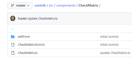
We know from the Form.io documentation that we can create and add new components. Therefore, we can create simplified components where we specify which options appear in the edit-form files. The contribution repository of Form.io shows a simple example of a custom component. We can see that in the editForm folder, there exists the display.ts file, which specifies what appears in the Display tab of the check matrix edit form.
export default [
  {
    key: 'labelPosition',
    ignore: true
  },
  {
    key: 'placeholder',
    ignore: true
  },
  {
    key: 'description',
    ignore: true
  },
  {
    key: 'hideLabel',
    ignore: true
  },
  {
    key: 'autofocus',
    ignore: true
  },
  {
    key: 'tooltip',
    ignore: true
  },
  {
    key: 'tabindex',
    ignore: true
  },
  {
    key: 'disabled',
    ignore: true
  },
  {
    type: 'number',
    label: 'Number of Rows',
    key: 'numRows',
    input: true,
    weight: 1,
    placeholder: 'Number of Rows',
    tooltip: 'Enter the number or rows that should be displayed by this table.'
  },
  {
    type: 'number',
    label: 'Number of Columns',
    key: 'numCols',
    input: true,
    weight: 2,
    placeholder: 'Number of Columns',
    tooltip: 'Enter the number or columns that should be displayed by this table.'
  },
  ...
The Result
Using the above techniques, we can create simplified components that remove many potentially superfluous tabs and fields in the edit form. An excellent example of that can be found in the BC Gov Common Hosted Form Service repository. Form.io components such as Textfield, Select, Checkbox, and others were re-created in that project. Simplified components inherited the original ones and had the extra options in the edit form redacted.
We have pulled and reused some of the above components and added more of our customization.
As can be seen, the edit form is much easier to understand and work with when only the most relevant options are available.
Less Is More … At Least Sometimes
By removing options, you can help the user navigate more easily, such as with Form.io, even if figuring out how to make those design changes can be a challenge. In this article we’ve shown different ways to remove some options in edit tabs and even to remove some edit tabs altogether to provide a more streamlined feel, reducing potential user confusion. All of the methods I’ve described are reversible too, so whenever users need to edit components more, a bit of code change will easily allow this.
About the Author

Top photo by Glen Carrie on Unsplash


